Davis Advertising creates interactive websites, so your customers can achieve their goals.
This is an important statement, and one that should immediately resonate with a company that puts its customers first. We build highly engaging websites based on UX, or the User Experience. Maximizing your user experience now requires a ‘mobile-first’ design model.
Unless your business falls into a couple of distinct categories, your website is probably being visited more on a mobile device than a desktop computer. It’s more convenient for the average user to reach into a pocket and pull out a phone than it is to cross the house or apartment and sit down at a computer. With that in mind, the idea of a responsively built website—one that is designed for a desktop but will respond down to a mobile device—is no longer the appropriate way to design. Now, it is more important to nail the mobile user experience first and foremost and then build up for desktop.
When smartphones were just starting to gain a foothold in our website usage, a responsive website was the way to go. The design philosophy of a responsive website was, “Can everything still work on mobile (look right, function appropriately, etc.)? Do we have to subtract anything because it won’t work on a phone?” This way of thinking is no longer effective, which is why the change to mobile-first was necessary. With a mobile-first design concept, we build based on the primary device—the phone. We spend time determining what the goals are for the mobile user. Is it buying something, starting a communication channel, researching a brand or product? Every company is different, so determining the exact goals that a company’s average customer will use the website to accomplish takes a little research time. Looking at analytic data, from both the mobile and the desktop, helps to determine some of the differences in usage.
Thinking about mobile-first design leads to some changes in how websites are thought of in general. If you are on a phone, what is the easiest way to interact with a company? Most of the time, it’s with the company’s app. However, downloading and setting up an app takes a certain amount of commitment from the user. It’s going to take up memory on the phone, and there may be some type of more formal sign-up process. If it’s an infrequent interaction with the company, the customer may simply consider it not worth it. But if the app provides a better experience, wouldn’t mirroring the app functionality on the mobile site make sense?
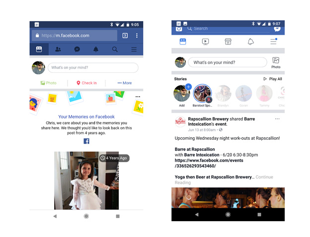
The image below is of an app (right) and a mobile website (left), from a company that understands the importance of functionality and the overall user experience remaining the same on both. The app has more functionality, but the mobile version is pretty close.

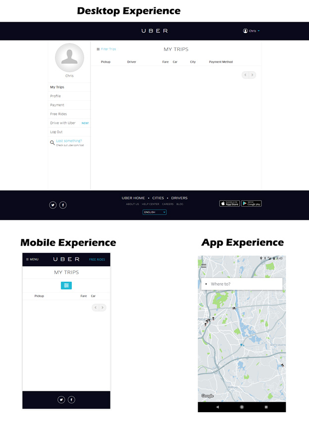
Again, it comes down to customer goals. If the customer goals require a dissimilar experience on an app than they do on a website, there should be a difference. In the next example, we’ll look at Uber. Uber’s entire experience is based in the app. Therefore, they have done the opposite, and made their mobile experience match the desktop experience, neither of which are anywhere near as effective as the app. Unless your business truly functions almost exclusively through an app, you shouldn’t follow their example.

Look at your company’s website usage and determine what the main customer goal is for visiting. Design a wireframe of what a mobile customer would use your site for and determine the best placement of links, buttons and information and build that. Next, determine if there are additional features that you could put on a desktop that wouldn’t work on mobile but would add to the experience on a desktop and design those specifically for desktop users. Because simply loading up the desktop, and then saying, “What can I take out?” or “How do I mush this around so it works better?” is never going to provide the best results.
